Plot Networks
UrbanAccess offers some basic plotting methods to visualize your UrbanAccess network data.
For example you can:
Plot the transit network
 AC Transit and BART transit network for Oakland, CA
Plot the street network
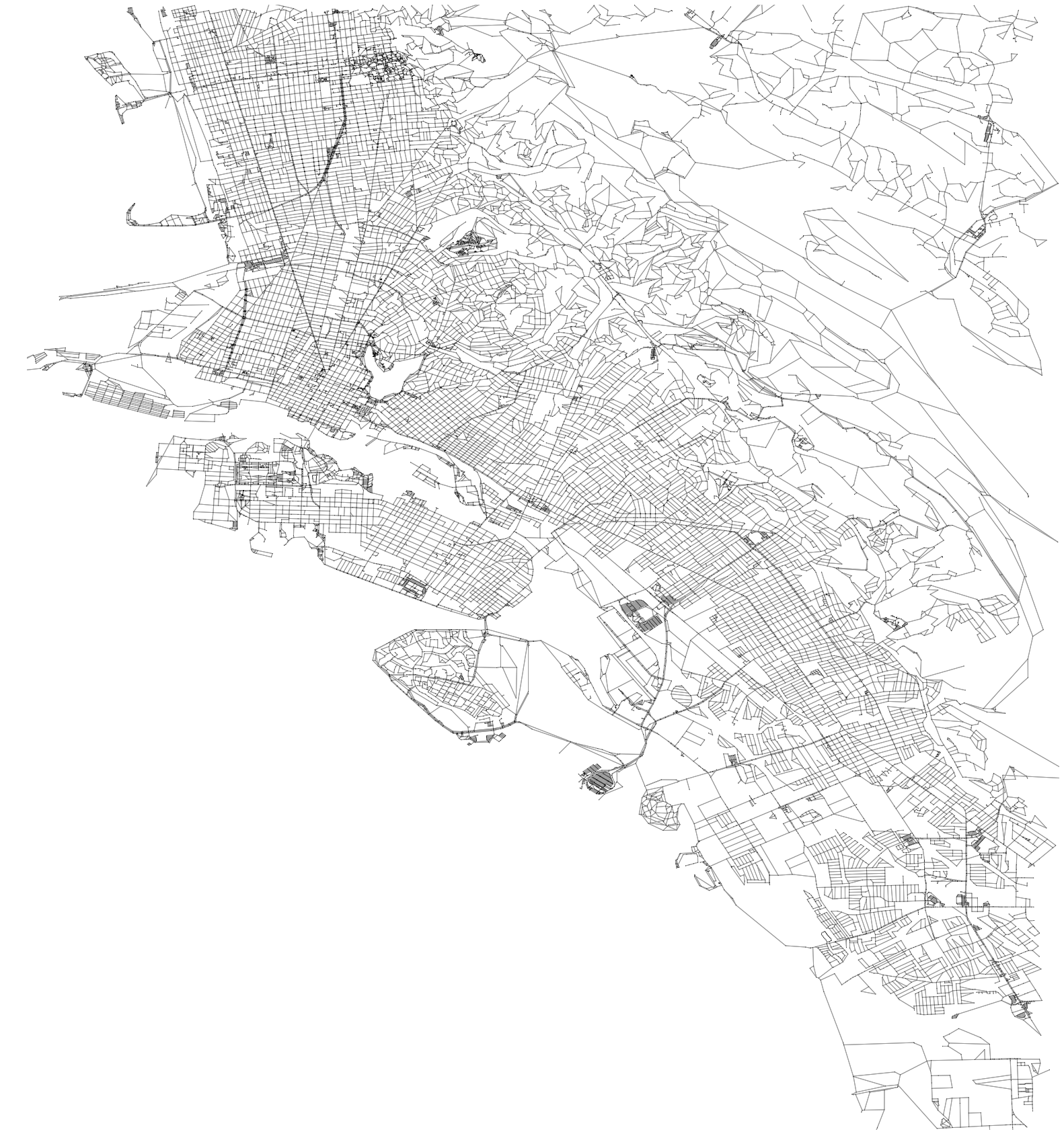 Pedestrian network for Oakland, CA
Plot the travel times on the integrated network
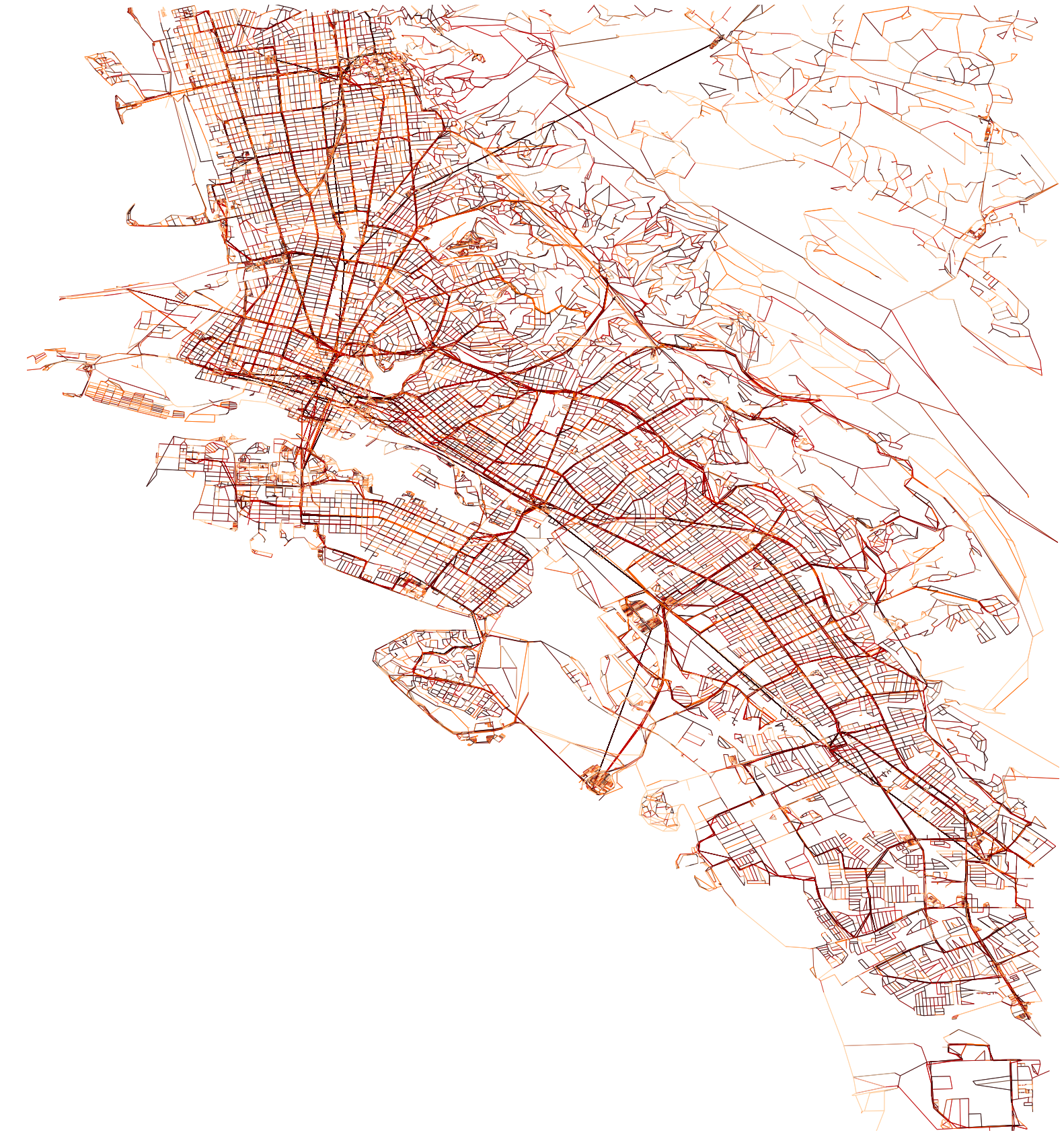 Integrated AC Transit and BART transit and pedestrian network travel times for Oakland, CA
-
urbanaccess.plot.plot_net(nodes, edges, x_col=None, y_col=None, from_col=None, to_col=None, bbox=None, fig_height=6, margin=0.02, edge_color='#999999', edge_linewidth=1, edge_alpha=1, node_color='black', node_size=15, node_alpha=1, node_edgecolor='none', node_zorder=3, nodes_only=False, ax=None)¶ plot urbanaccess network nodes and edges
- Parameters
- nodespandas.DataFrame
- edgespandas.DataFrame
- x_colstr, optional
x coordinate column in nodes dataframe
- y_colstr, optional
y coordinate column in nodes dataframe
- from_colstr, optional
name of column to use for ‘from’ node id
- to_colstr, optional
name of column to use for ‘to’ node id
- bboxtuple, optional
Bounding box formatted as a 4 element tuple: (lng_max, lat_min, lng_min, lat_max) example: (-122.304611,37.798933,-122.263412,37.822802) a bbox can be extracted for an area using: the CSV format bbox from http://boundingbox.klokantech.com/ if None bbox will be calculated from spatial extents of data
- fig_heightint
matplotlib figure height in inches
- marginfloat
margin around the figure
- edge_colorstring
color of the edge lines
- edge_linewidthfloat
width of the edge lines
- edge_alphafloat
opacity of the edge lines
- node_colorstring
node color
- node_sizeint
node size
- node_alphafloat
node opacity
- node_edgecolorstring
the color of the node border
- node_zorderint
zorder to plot nodes, edges are zorder 2. A node_zorder 1 will plot nodes under the edges, 3 will plot nodes on top
- nodes_onlybool
if true only the nodes will plot
- axmatplotlib.axes._subplots.AxesSubplot, optional
matplotlib axes, as given by, for example, plt.subplot. Use to specify the projection.
- Returns
- fig, ax
-
urbanaccess.plot.col_colors(df, col, num_bins=5, cmap='spectral', start=0.1, stop=0.9)¶ Get a list of colors by binning a continuous variable column into quantiles
- Parameters
- dfpandas.DataFrame
- colstring
the name of the column in the dataframe with the continuous variable
- num_binsint
how many quantiles
- cmapstring
name of a colormap
- startfloat
where to start in the colorspace
- stopfloat
where to end in the colorspace
- Returns
- colorslist